HIKE WITH ME

DESIGNING A WIN-WIN
Where User Goals and Business Goals Reach the Summit Together
In a world with the app Hike with Me, users are lacing up their hiking boots, raising their heart rates, and spending more time with friends in the midst of natural wonders and thrilling adventures. Communities are healthier, more active, and more connected. And, as more users download the app to reach the summit, business thrives.
It's a win-win.
This is where I come in, the UX designer tasked to take these goals and create the ideal user flow.
USER RESEARCH
Let's get specific, who's using this thing?
Joaquin, a 30-year-old male in sales, is a high-mileage user of the Hike with Me app. Joaquin uses the Hike with Me app to schedule hikes with his busy fiends while maintaining his healthy and active lifestyle. Joaquin enjoys challenging himself and likes to hike longer distances that range in difficulty.
Shania, a 24-year-old female accountant, has just downloaded the app and rounded the corner of her first switchback. Shania is new to hiking and is hopeful the Hike with Me app can help her become more active and lead a healthier lifestyle. She also wants to meet new friends who enjoy being active.
These personas represent two categories of user that Hike with Me wants to better serve. With the goals of these two personas in mind, I set out on the next step of the process.

CARD SORT
Loaded with a stack of cards and a mind to create the path of least resistance, I wrote out each step in the “Scheduling a Hike” process for each user persona. After arranging the cards in as many different ways as possible, I found a user flow that allows both personas to achieve all of their goals in as few clicks as possible.
WIREFRAMES
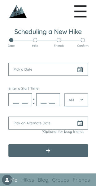
With the user flow to guide me, I began creating wireframes for each step in the flow. After ideating with pen and paper, iterating using design software, and eliciting feedback, I settled on layouts for each screen that are both functional and beautiful. These designs utilize the human interface guidelines to ensure functionality with all items large enough to easily touch with a finger (or thumb!) These designs also maximize whitespace, contrast, and alignment to guide the users actions as they seamlessly input information in to the form fields and complete all of the steps.

BRAND IDENTITY
Bold, Adventurous, and Inviting
To turn my low-fidelity wireframes into high-fidelity mockups, it was time to give the Hike with Me brand a captivating personality. I used a monochromatic color scheme with dramatic value contrast and sharp-edged shapes to create the bold and adventurous aspects of this personality. I used a lightweight sans serif font with a high x-height and spacious vertical rhythm that is easy to read and rounds out the brand personality with an inviting feel.


